SAP Analytics Cloud
Year
2025 - On going
Scope
UI, UX, Design with AI
Compay
SAP
Redesigning the story creation entry experience for one of the world's most widely used enterprise analytics platforms.
What is this product?
SAP Analytics Cloud is an enterprise business intelligence platform used by large organizations to build data stories, dashboards, and reports at scale. Think of it as a powerful Tableau or Power BI, deeply integrated with SAP's ERP data infrastructure. The organizations using it daily include Bosch, Red Bull, Nestlé, Google, and ExxonMobil.
Here is how it is supposed to work: you open a blank canvas, a data panel appears on the side showing your available data sources, you drag one onto the canvas, and that act of dropping it starts your story. Simple in theory. This project existed because that experience was broken in practice.
"How do I even start building a data story?"
That question came up in every single user walkthrough we ran. Not because SAC is not powerful. It is extremely powerful. But the entry experience had been designed around what the platform could do, not around how users think when they open a blank canvas for the first time
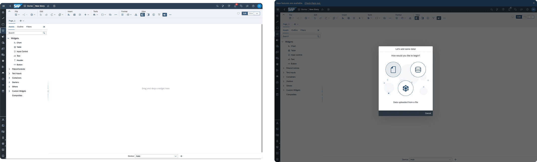
No clear entry point
The canvas opened blank with no signal about where to begin or how data would flow in. First-time users and experienced analysts stalled at the same moment: what do I click first?Usage data: meeting and call durations, attendance, participation metrics, and collaboration patterns.
Hidden data access
Adding a data model required navigating to the top shell bar and digging through overflow menus. The thing users needed most was the hardest to find. Breaking momentum at step one compounds at enterprise scale.
Broken drag-and-drop affordances
Drag-and-drop was technically supported but lacked hit zones, visual feedback, and clear targets. It felt unsafe to use. Users could not tell if dragging would work, where to drag to, or what would happen when they let go.
One-size onboarding hurt power users
A previous beta introduced a step-by-step modal lightbox. It helped new users orient themselves but frustrated experienced analysts who wanted to skip setup and work immediately. The same pattern was failing both user types.
What I owned versus what we shared
My ownership
End-to-end UX lead: problem framing through engineering handoff
Current state flow mapping and emotional journey analysis
Entry point concept exploration and validation
Data panel architecture and interaction choreography
End-to-end flow from entry point to drag-and-drop readiness
Engineering specification, floorplan, and do's and don'ts
Cross-team alignment across SAC engineering and SAP Core Design System
SAC product designer (collaborator)
Detailed drag-and-drop behaviors and hit zone logic
Graph and widget creation based on entity and asset types
Visualization logic once data was introduced to canvas
Context before solutions
Before any UI, I mapped the current state user flow with emotional journey analysis, marking exactly where forward momentum collapsed. Then a competitive review against Power BI and Tableau focused specifically on blank canvas starting states, because that is where we were losing people. Persona-based walkthroughs with enterprise data analysts who build stories daily. Cross-functional workshops with design, product, and engineering to align on a shared problem definition before anyone touched Figma.

User flow map anaysis
"Drag-and-drop friction was a symptom. The root cause was that users had no mental model for how data was supposed to enter the canvas at all."
That insight changed the scope of the project. Fixing the drag-and-drop interaction without first fixing the entry experience would just be patching the surface. The foundation had to come first.

Competitive analysis: SAC versus Power BI versus Tableau
Exploring, then deciding
We explored two distinct approaches to the entry point problem before converging on a direction.
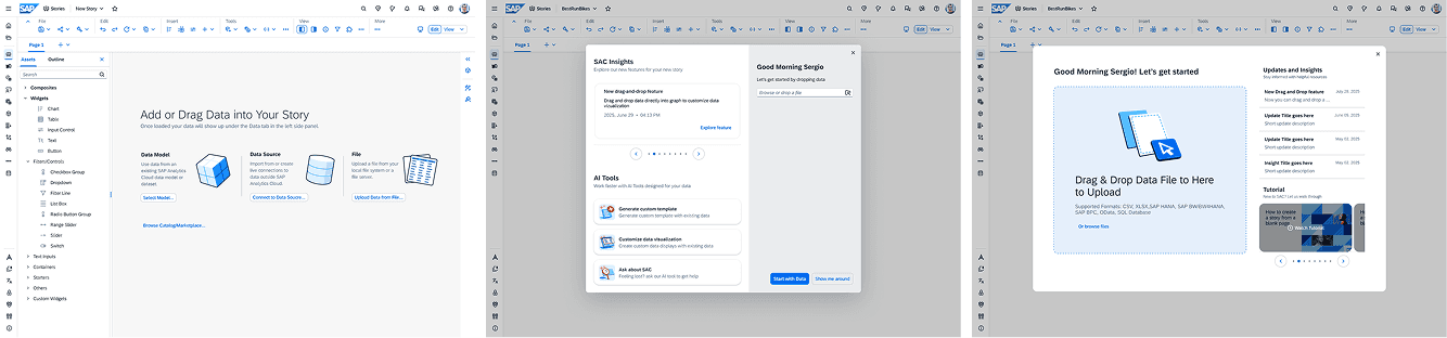
Concept A: contextual tooltips embedded in the blank canvas. Lightweight instructional nudges that guide users toward the first action without blocking forward progress. No modal, no forced path. The canvas stays open and the guidance lives within it.
Concept B: a reframed optional lightbox. Rather than removing the existing modal entirely, we tested a more intentional version with a clear value proposition, quick-action shortcuts for power users, and an easy opt-out. This addressed the new user versus experienced analyst split more directly.
Before & After
The hypotheses we were testing:
A blank canvas needs guidance, not silence. Users need lightweight cues to understand where to start, without being forced through rigid onboarding.
Entry point clarity directly impacts drag-and-drop success. If users do not understand how data enters the story, drag-and-drop interactions later in the flow will feel confusing and unsafe.
Power users should control their own onboarding. Mandatory lightboxes create friction. Dismissible guidance preserves speed without removing support.
A persistent data panel establishes mental models early. Making data visible by default helps users understand what actions are possible before they touch the canvas.

Before & After

Concept testing

User testing confirmed our direction. Users understood where to begin without verbal instruction, which was the core test. Optional guidance worked for both user types: power users dismissed it immediately and new users used it without feeling forced. The data panel changed the emotional register of the experience. Users described feeling less lost when data was visible from the start. The panel did not just solve a navigation problem. It changed how confident people felt about beginning.
From concept to infrastructure
Phase 3 was where design became infrastructure. Validated concepts are only useful if they can be built reliably, extended without breaking, and understood by engineers who were not in the room when the decisions were made. That gap between design intent and engineering reality is where most enterprise design work quietly falls apart.


Floorplan
The specification covered: interaction logic for the story creation entry point, data panel behaviors across all states and contexts, edge cases and alternate flows for new users, power users, existing stories, and templates, panel choreography and layout rules we called the floorplan internally, and explicit do's and don'ts tied to system constraints so future designers could extend the system without breaking it.
Working within SAP's design system, not around it
SAP Analytics Cloud operates on SAP UI5 Horizon, a design system shared across 7,500 SAP applications. It is deliberately conservative because downstream effects of changes are significant and difficult to reverse. Our detachable panel and drag-and-drop patterns fell outside what the system natively supported.
Rather than writing custom code and moving on quietly, we built a formal case for the exception. Usability research showing why standard components did not work for analytics workflows. An engineering feasibility assessment. A clear argument for why SAC's unique context would not create downstream problems for the rest of the system.
The Core Design System team approved it as a supported exception: documented, maintainable, and safe to extend. That kind of outcome only happens when design and engineering make the case together rather than design making a unilateral call.
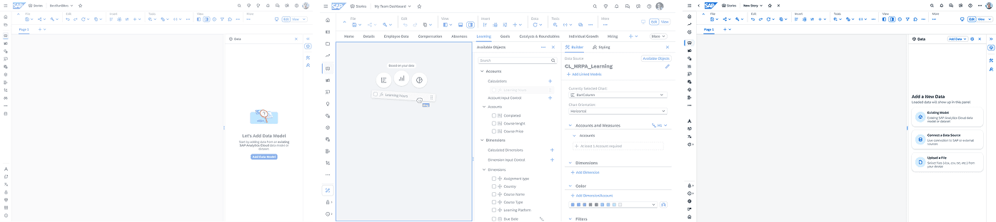
What shipped
What comes next, The Engagement Layer
The Core Design System team had an existing design system called the Engagement Layer, built specifically for concept-level dashboard prototyping. It came with a JSON token file, a CSS library, and a Figma component set. The SAC team wanted to use it to rapidly prototype future data story building concepts without going through a full design cycle every time.
The problem: the Engagement Layer existed in formats that designers and PMs could not actually move fast with. JSON and CSS files are not something a PM opens when they have a concept to test on a Monday morning. And Figma requires design skill and time. The system existed but the speed it promised was not accessible to most of the people who needed it.
I took the lead on solving that gap. I converted the Engagement Layer design system into a vibe coding-ready package: a structured markdown skill file and a Git repository that any PM or designer could clone directly. Once cloned, they could describe a dashboard concept in plain language to Claude Code and get a working, Engagement Layer-compliant prototype back, using the actual components from the system, not generic UI that happens to look similar.
The goal is to reduce the distance between a concept and a testable prototype to a single Claude Code session. PMs and designers clone the repo, describe their idea, and get something built with real Engagement Layer components that can go straight into a stakeholder review. The system scales beyond any single designer's availability because the design knowledge lives in the package, not in the person.
Currently in progress with the SAC and Core Product Concept teams. Target: Q3 2026.The Vibe Code Guide solves this by giving the AI a structured skill file describing the design system before it generates anything:
What this project changed in how I work
Enterprise design at scale has a different failure mode than consumer design. The risk is not usually that the interaction is unclear. It is that the design is clear to you, unclear to engineering, interpreted differently across three teams, and shipped as something you would not recognize. Every decision I made in Phase 3 was oriented around closing that gap. Precision in enterprise design is not a constraint on creativity. It is the creative act.
I also came away with a clearer belief about design systems: the right response to a constraint is not to work around it quietly. It is to make the case for an exception clearly enough that the people maintaining the system trust you with it. That requires knowing the system well enough to argue from inside it, not against it.
And the Engagement Layer showed me something about where design is going at scale: the most durable design system is not a document. It is a set of rules precise enough to be taught to an AI and evaluated without a designer in the room.
"I don't want to be biased. If I assume someone is introverted, I might not bother them as much."