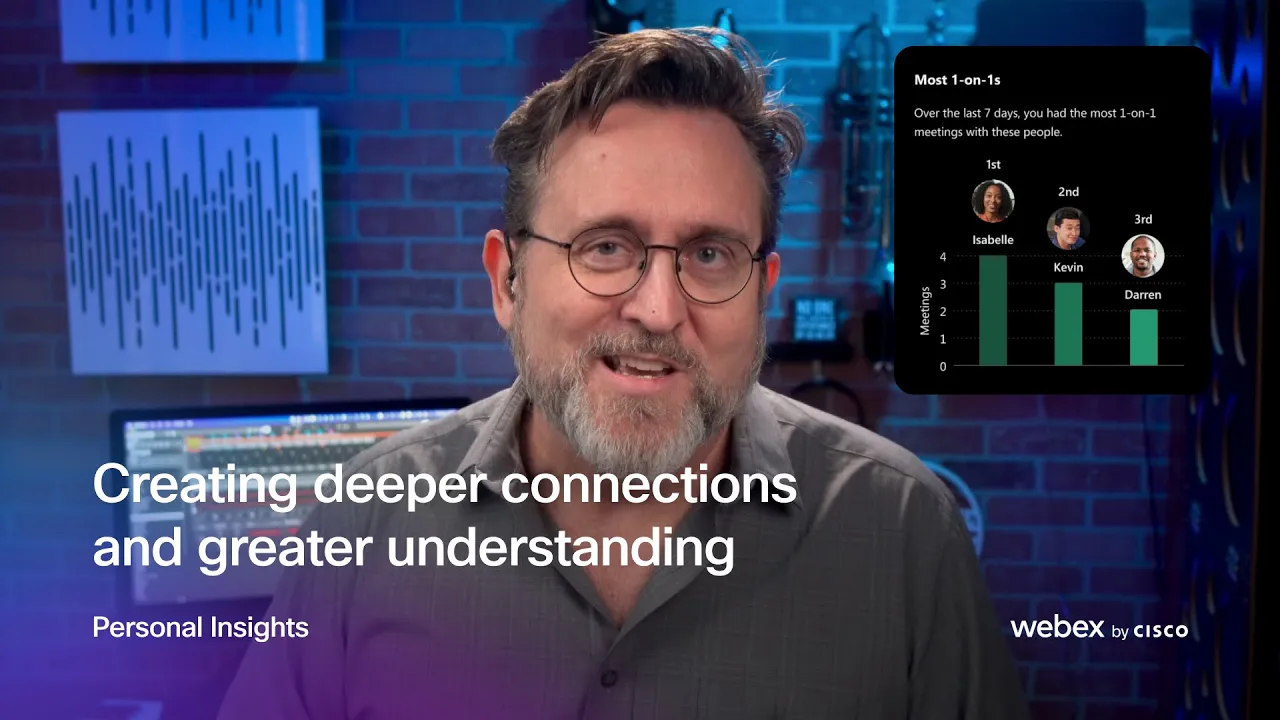
Personal Insight
Designing a trusted productivity insights experience for 650K+ monthly users, turning behavioral data into clear, actionable, and beautifully crafted personal reflections.
Year
2022-2024
Scope
Product Design, Visual Design, Interaction Design, Research, Accessibility
Compay
Webex, Cisco
Personal Insights started with a bold question: how do you give people meaningful, data-driven reflections about their work habits without making them feel watched?
The product needed to feel personal, trustworthy, and genuinely useful, more like a thoughtful companion for your workday than a performance dashboard. My role was to lead the design vision from early exploration through shipped product, owning the end-to-end experience across research, interaction design, visual design, and accessibility.
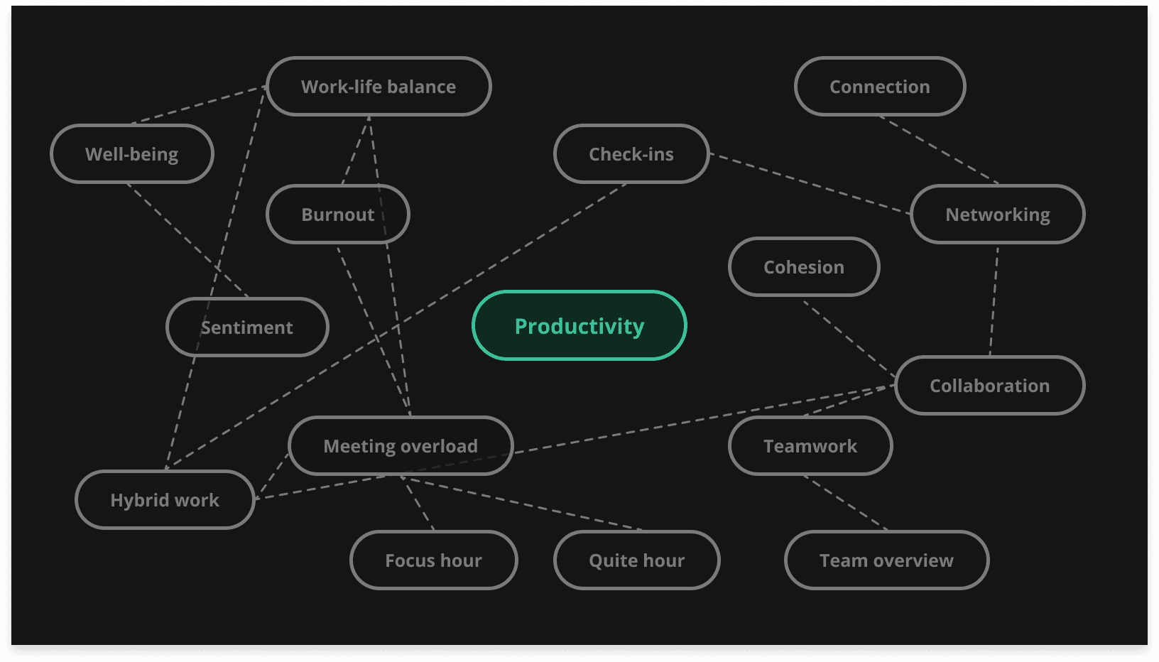
Framing the right problem
We began with open-ended exploration, mapping the space through keyword mind maps, cross-designer collaboration sessions, and rapid concept sketches. The team generated a wide range of ideas before narrowing focus. The questions guiding us weren't technical, they were human:
How do people actually feel about their daily workload? What would make someone trust a tool that reflects their behavior back to them? How do you design insights that motivate without creating pressure?
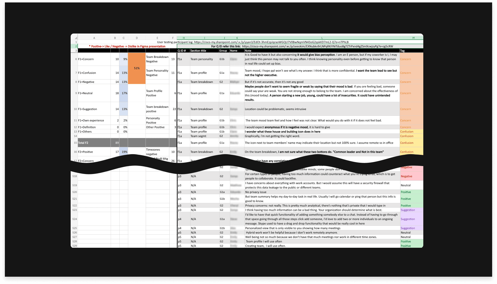
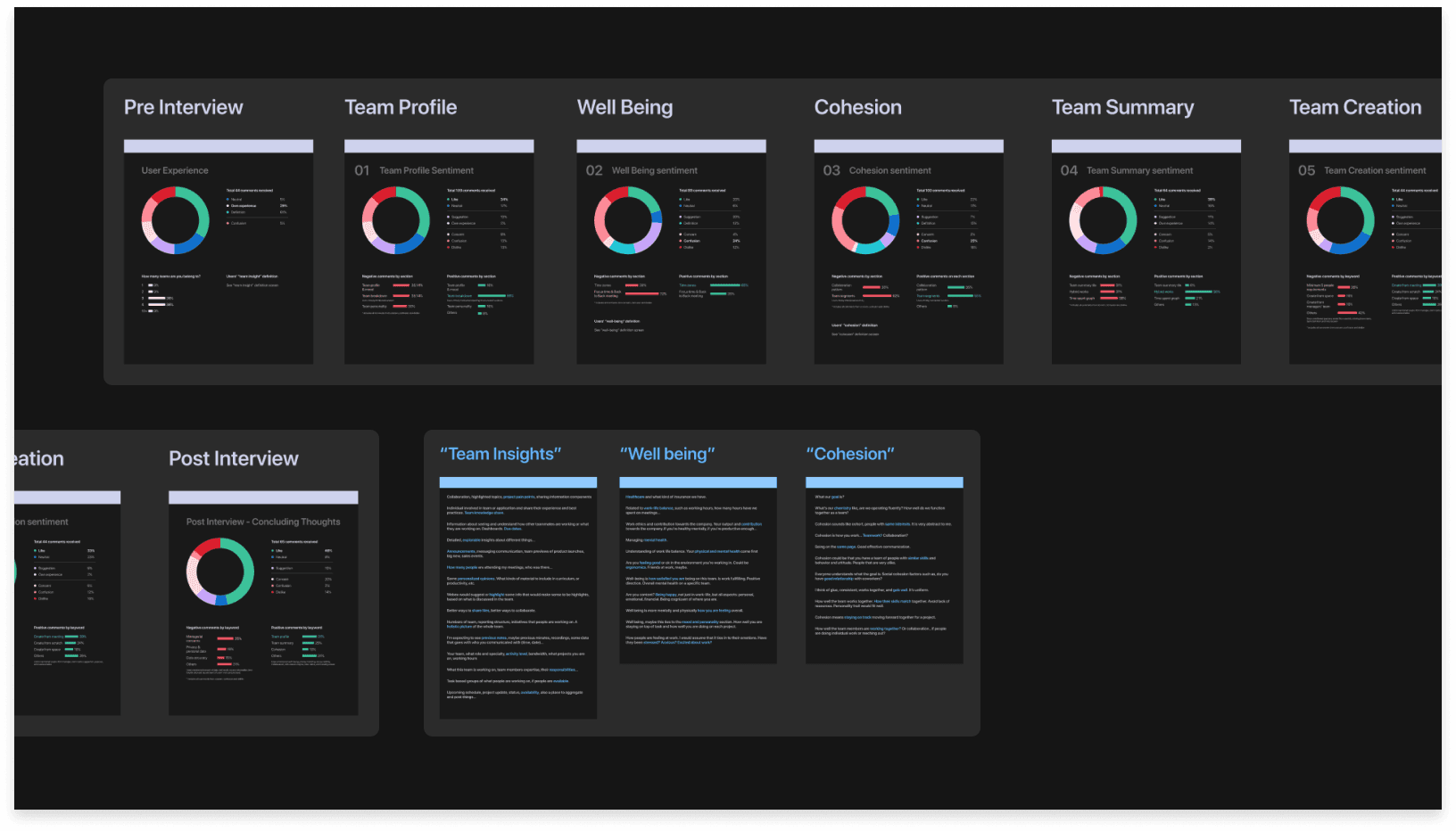
To answer these, I led a hybrid research approach combining attitudinal interviews with prototype-based usability testing across five distinct concepts. This let us measure not just what worked functionally, but what felt right emotionally.

Letting users reshape the product
The research fundamentally changed our direction. Users weren't confused by the data. They were uncomfortable with how it was framed. Three signals stood out:
First, users worried about exposure. Displaying too much behavioral data, even when anonymized, made people anxious about how managers might interpret it. The insight here wasn't about adding privacy toggles, it was about rethinking what we show in the first place.
Second, location-based features felt like surveillance. Showing where colleagues were working created social pressure rather than connection. We cut the feature entirely and redirected toward direct collaboration signals.
Third, personality categorization backfired. Labeling users as "introverted" or "extroverted" risked creating bias. We replaced this with a connection-focused model that tracked organic relationship growth without judgment.
These weren't minor pivots. They reshaped the product's entire philosophy from monitoring to self-reflection.
Guided by users: using key findings as our compass
The research shaped our direction in concrete ways. Users had different mental models for what each feature meant, and the original categorization under terms like "well-being" and "cohesion" created confusion rather than clarity. Privacy concerns were real but vague, with people worried about how the data might be perceived by managers. What they wanted was a tool that helped them connect and reflect, without adding social pressure.
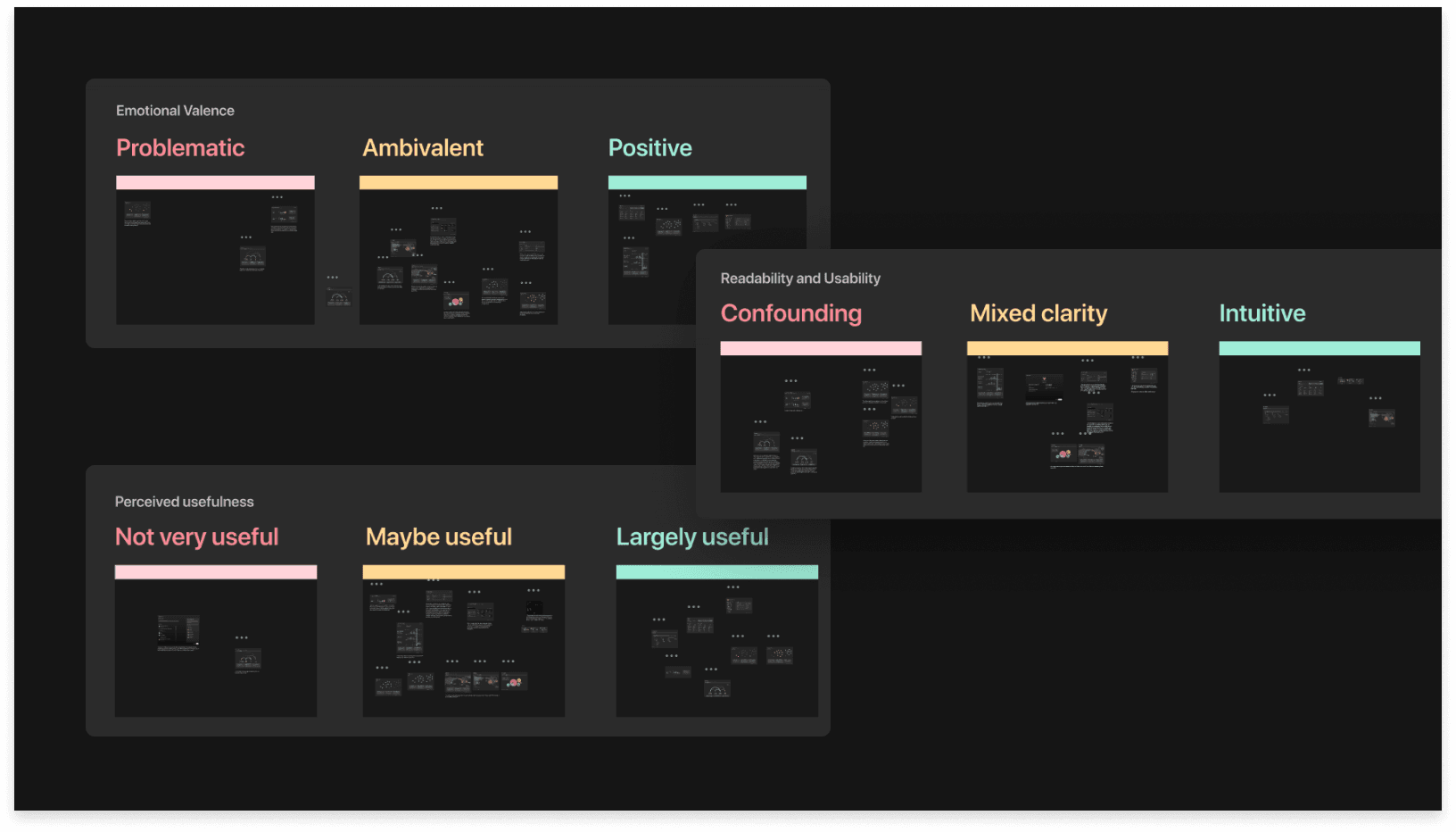
Based on our research findings, we organized our ideas according to emotional valence, readability, usability, and perceived usefulness, allowing us to streamline our potential solutions.
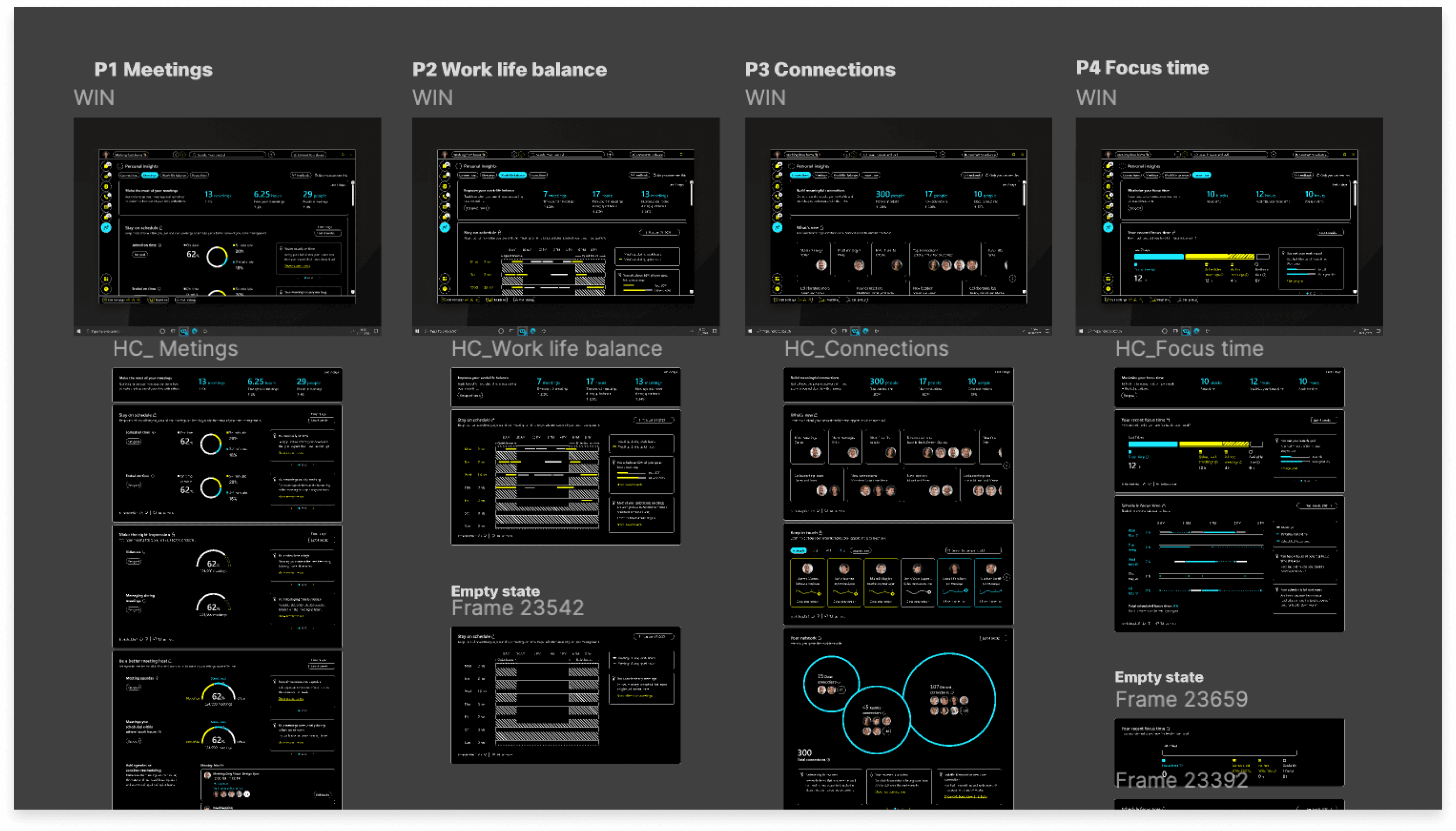
Crafting a polished experience people actually want to use
The design challenge was making complex behavioral data feel simple, beautiful, and personal. Enterprise productivity tools tend to default to dense tables and generic charts. We set a higher bar: clear visual hierarchy, intentional use of color and typography, and progressive disclosure that lets users go deeper only when they choose to.
I focused on four design principles throughout:
01. Indecent exposure
Many users expressed concerns about the lack of guidance and clarity regarding intent. They argued that just because something can be displayed doesn't mean it should be. Information intended to promote one type of behavior can easily lead to unintended consequences.
"For certain types of people, having too much information could counteract what you’re trying to do, which is to get people to collaborate. It could backfire.”
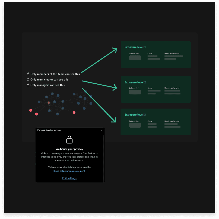
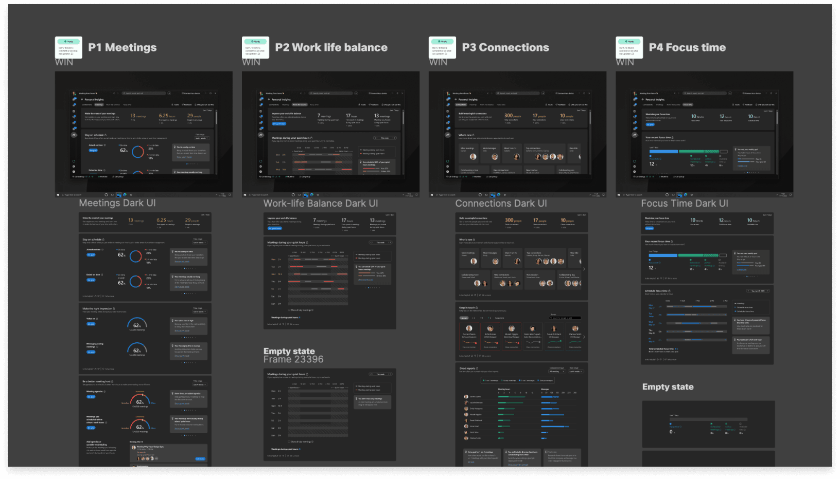
We updated our design to focus on "manager insights" versus "team insights," allowing individual contributors to use these insights as tools for engaging with others, not just managers. Additionally, we provide clear definitions of exposure levels and data usage, ensuring that analytics are tailored specifically for the user.
02. Hybrid season, or is it over?
Hybrid work is now a reality for many, highlighting the need for a formal tool to organize hybrid schedules. However, user feedback shows that lifted workplace policies raise concerns about social pressure and anxiety regarding colleagues' locations, potentially pushing employees in specific directions.
" We're a hybrid in a couple different ways. Also, there's a discussion about when to bring everyone to office.”
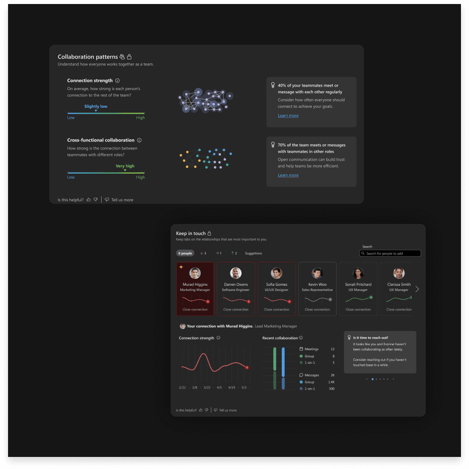
Considering Webex's diverse user demographics, a feature showing employees' physical locations may not be effective. There's no clear link between location and collaboration. Instead, our team opted to promote direct collaboration over surface-level interactions like office attendance.
03. The grey areas of judgment
Users' responses made us consider: What judgments are we asking our users to make about one another? We need to keep this question in mind as we design insights that reveal individual behaviors and traits, as these could lead to biases toward colleagues.
" I don’t want to be biased. If I assume someone is introverted, I might not bother them as much.”
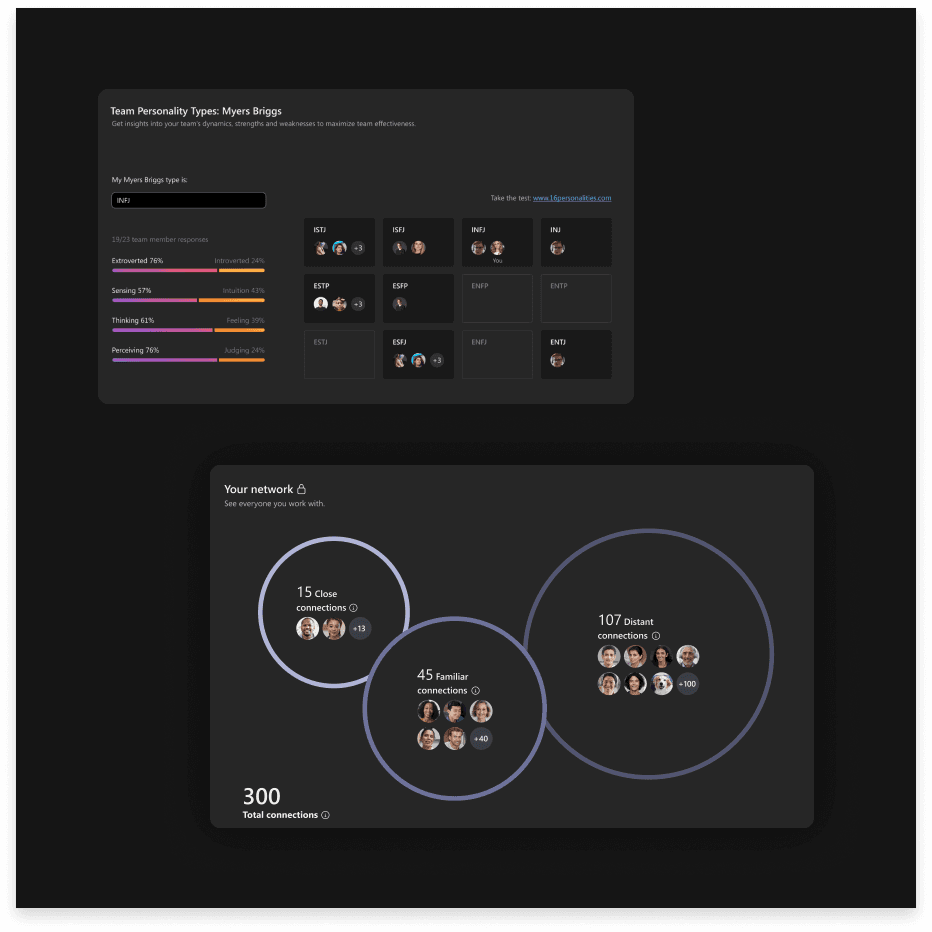
Our team shifted from personality categorization to a connection-focused solution that allows users to reach out to colleagues and track the organic growth of their network.
04. Wellbeing vs Productivity
There is a distinct tension between viewing well-being as a means to enhance productivity and recognizing it as a crucial factor for the mental, physical, emotional, and relational health of the team.
" What else could help understand well-being? “What about break timing? and aligning break timings to improve health and improve productivity for the company."
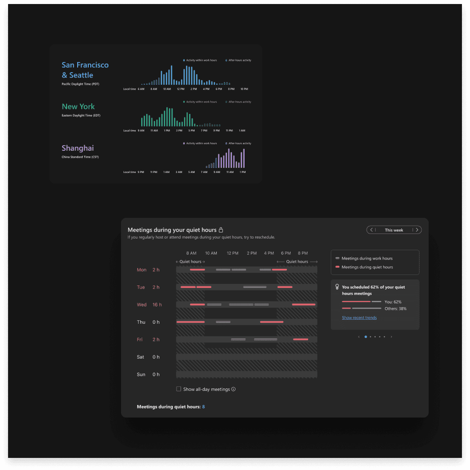
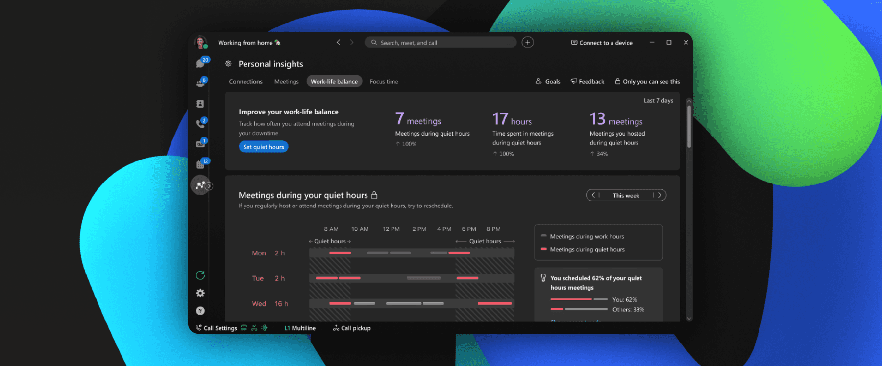
The solution shifted from monitoring everyone's data to focusing on individual productivity. A generalized data chart wasn't successfully conveying the intended message, so our team concentrated on identifying interruptions that may affect users' work-life balance.
05. Categorizing insights with clear vocabulary
Many users reacted positively when they could easily read the data and its explanations. However, when the insight content was categorized under specific terms like "well-being" and "cohesion," users often felt uncertain about which teams the data referred to and developed varying definitions and expectations.
To address this, our team reorganized the features with clear, intuitive, and simple categorizations by revisiting the initial mind map.

Final Touches
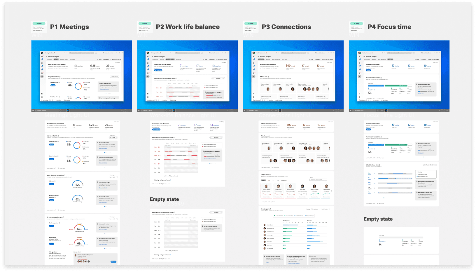
By aligning with users' mental models and holding a high bar for craft, we shipped Webex Personal Insights as a unified experience across desktop and mobile. The product helps enterprise users reflect on their productivity, strengthen collaboration patterns, and take control of their work-life balance.
Keeping It Sustainable and accessible for All
Accessibility wasn't a compliance step at the end. It was woven into the design process from the start. I partnered with accessibility evaluators and engineering to resolve 140 accessibility tickets, ultimately achieving WCAG 2.2 AAA compliance.
This included full support for voiceover, keyboard navigation, and right-to-left languages. The visual design was stress-tested across contrast ratios, screen sizes, and assistive technologies to ensure every user had an equally polished experience.
I continuously collaborate with the broader team to create a consistent experience throughout the Cisco app to align our feature UI specifications with their guidance, creating any additional components as needed and organizing our UI specifications to accommodate all operating systems and devices.
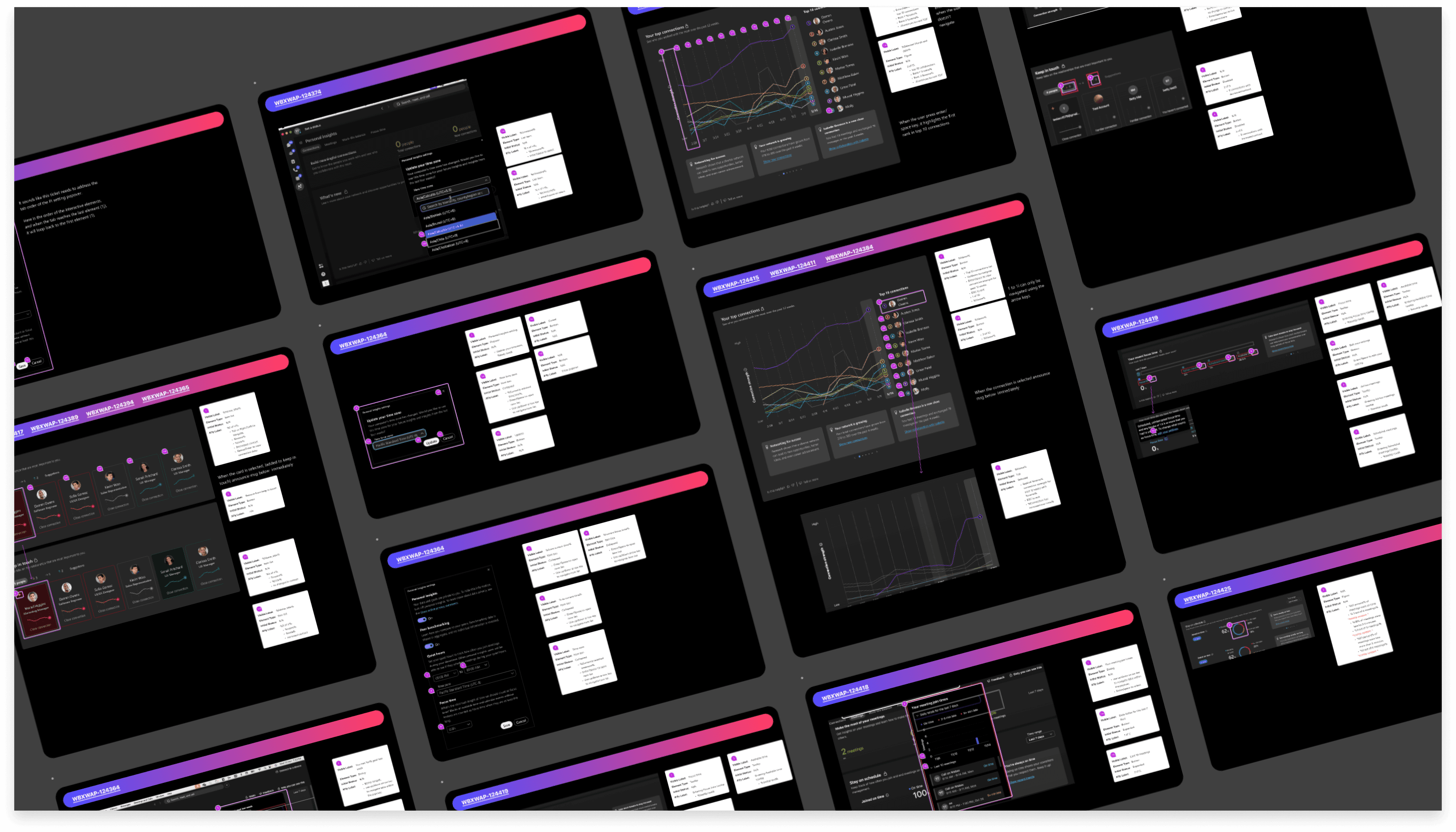
I worked closely with engineers and accessibility evaluators, to enhance our features in line with WCAG requirements, providing a synchronized experience for users with disabilities and those using right-to-left languages.
Just the beginning
Personal Insights launched as a unified experience across desktop and mobile and has been live since 2021. Key outcomes:
650K monthly active participants
Adopted by 36,000 enterprises globally
140 accessibility issues resolved, achieving WCAG 2.2 AAA
Supporting 30% non-English global user base including right-to-left languages
Steady growth in user engagement over time
This project taught me that trust is the most important design decision you can make. Not trust as a feature or a checkbox, but trust as a quality that lives in every visual choice, every word, every piece of data you choose to show or withhold.
It also reinforced my belief that enterprise users deserve consumer-grade craft. The bar shouldn't drop just because someone is using a work tool. People notice when something feels considered, and that feeling is what turns a feature into a product people actually want to use.