Recommended Messages
Designing an AI-powered messaging feature that learns from user behavior to surface what matters most, adopted by 56,000 users within 24 hours of launch.
Year
2021-2022
Scope
Product Design, Interaction Design, Visual Design, Accessibility
Compay
Webex, Cisco
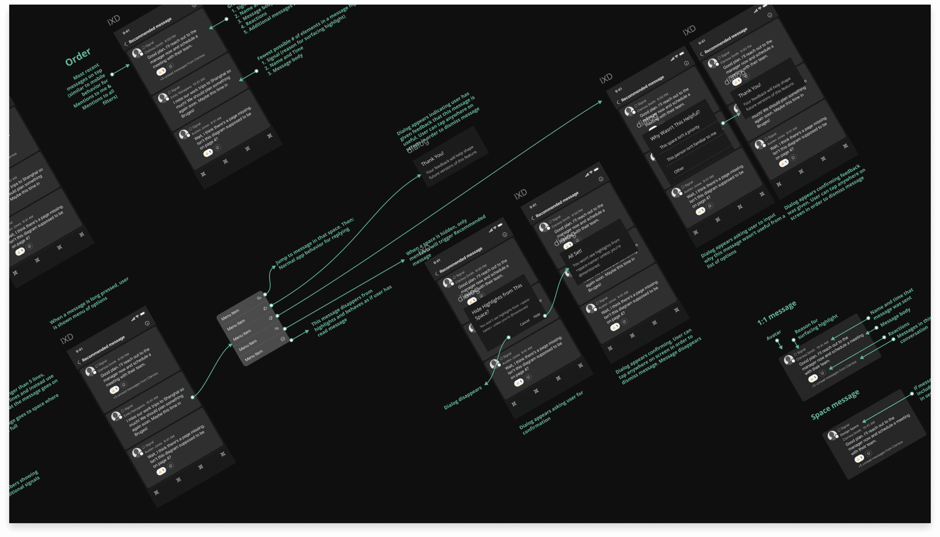
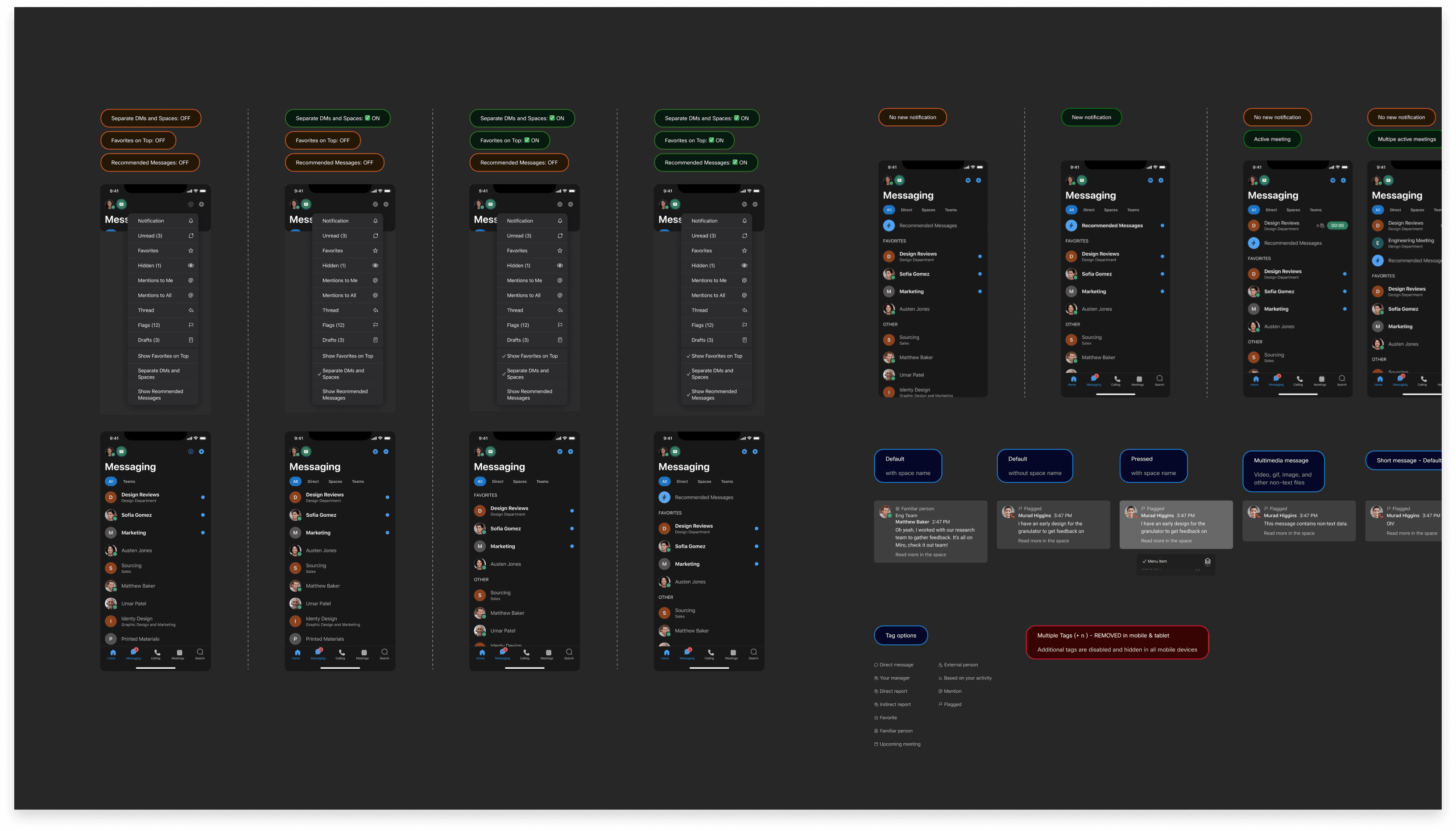
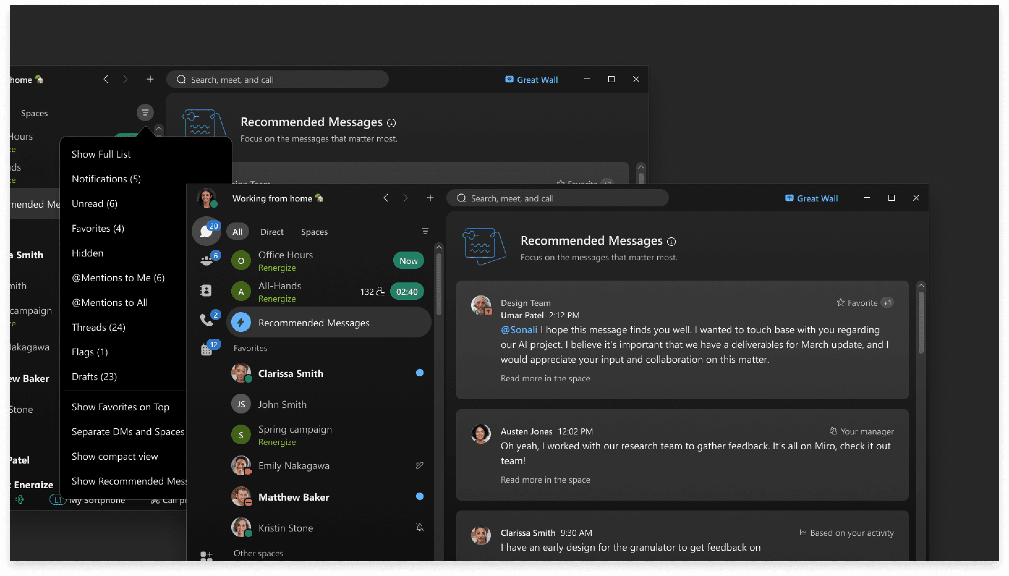
Webex Recommended Messages is a feature in the Webex App that uses behavioral signals to surface high-priority messages at the top of your space list. It learns from communication patterns such as frequency of interactions, active spaces, and pinned conversations that becomes more personalized over time, helping users focus on what actually matters.
Ugh. Why so many messages? In fast-paced enterprise environments, constant communication leads to inbox overload. Important messages from managers get buried under group threads, automated notifications, and low-priority chats. Users spend more time searching than responding. Our team recognized this as a design problem, not just a technical one. We set out to build a feature that filters noise and highlights key conversations, so users can act on what's important without digging through everything else.
The core concept is straightforward: the feature learns from each user's communication patterns, including who they talk to most, which spaces they engage with, and what they've pinned. Over time, it builds a personalized ranking that surfaces the right messages at the right moment.
As users continue to engage, the algorithm refines itself, making recommendations increasingly accurate and aligned with how each person actually works.
Starting with the enterprise reality
We partnered with researchers to synthesize feedback from enterprise clients, then translated those insights into feature concepts. Working closely with engineers, we assessed technical feasibility early and developed heuristic user flows and rapid wireframe mappings. A clear design rationale drove stakeholder alignment across the broader Webex team and secured buy-in for integration into the core messaging experience.
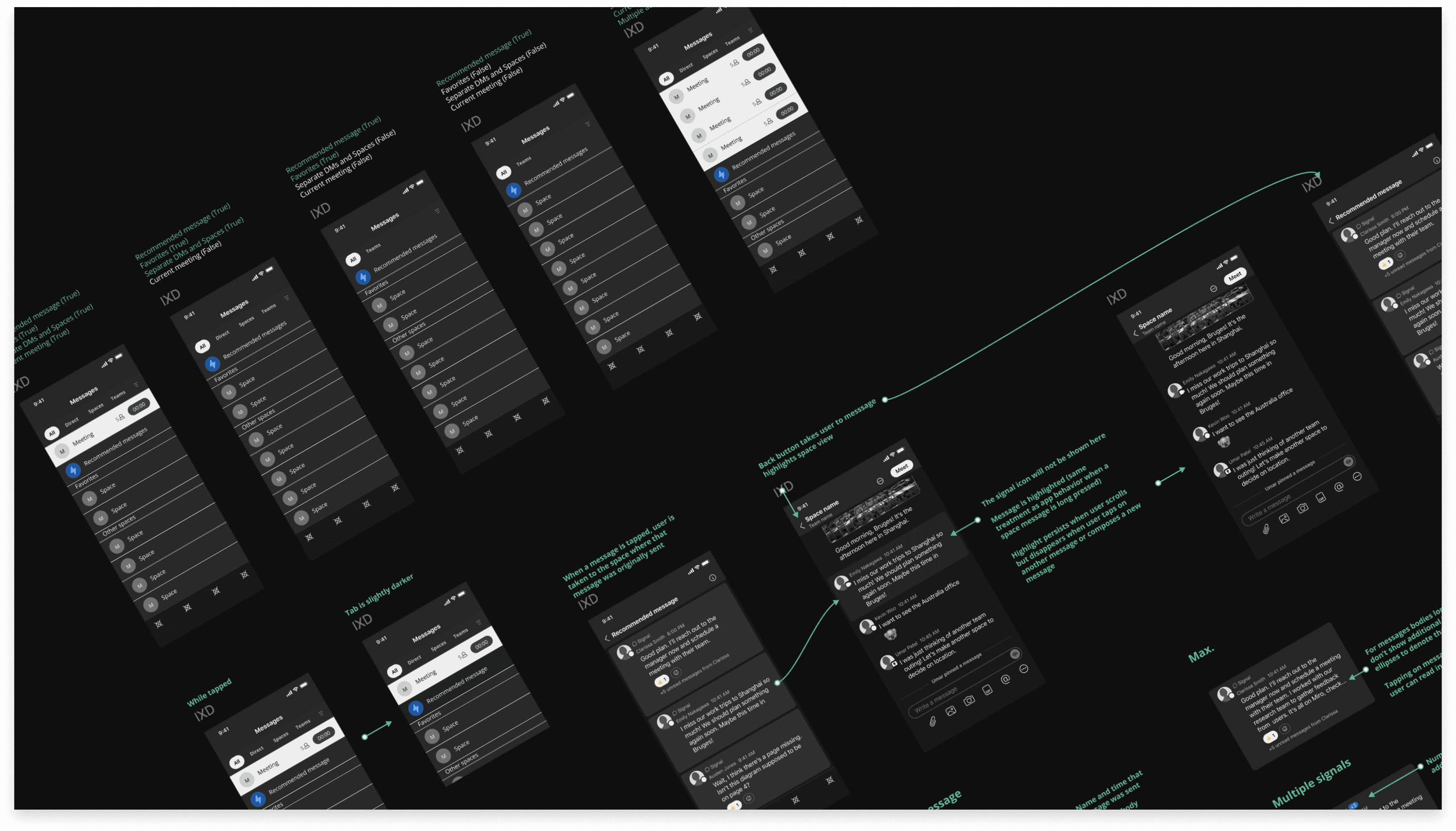
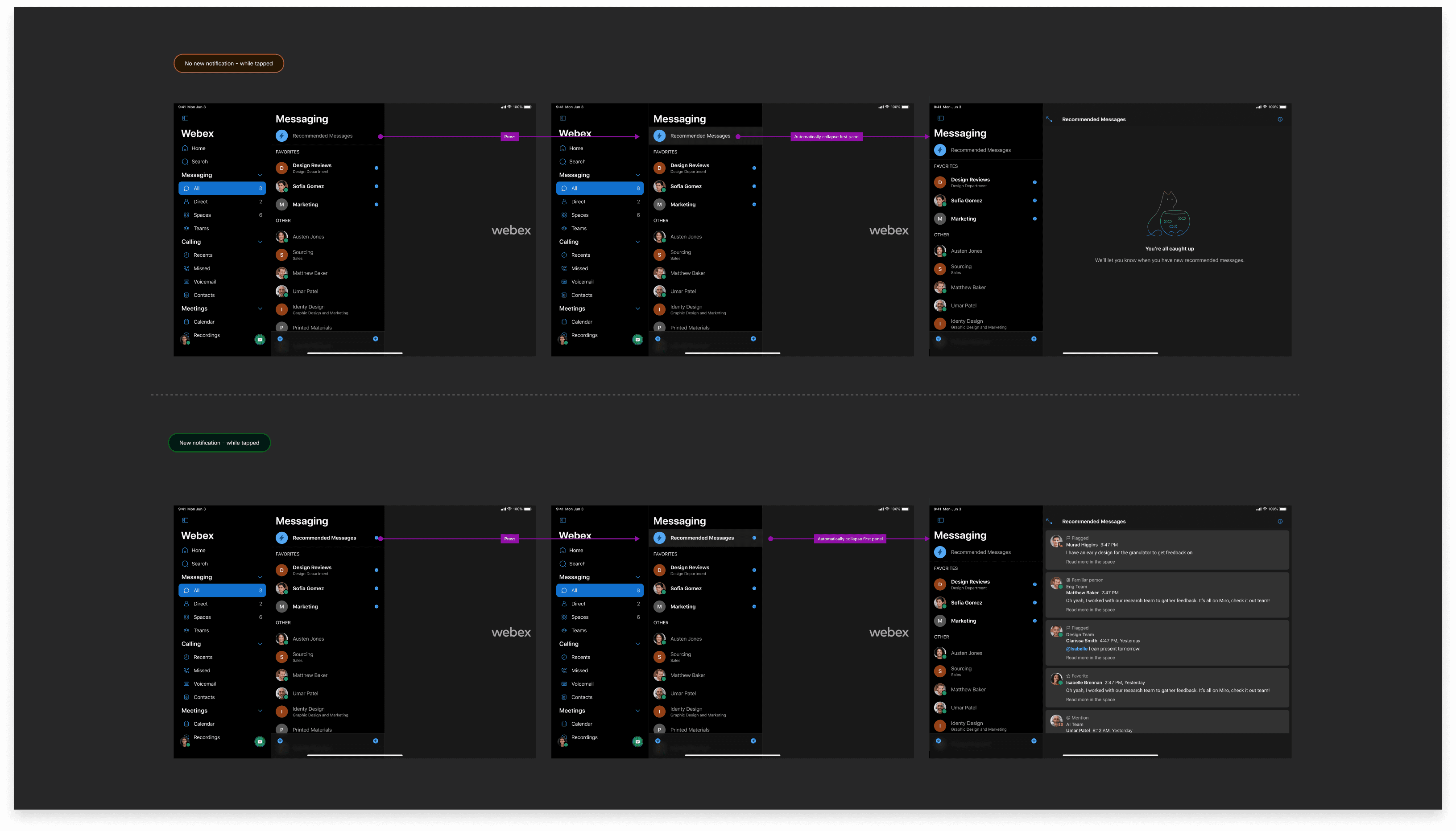
Mobile-first, for a reason
Existing client feedback revealed that the strongest negative sentiment came from the Webex mobile app. Users consistently flagged issues around finding messages, excessive scrolling, and navigating cluttered space lists.
For enterprise customers managing dozens of spaces including team channels, small group chats, direct messages. This created real problems on mobile: excessive thumb scrolling, physical fatigue, and high cognitive load just to locate a single conversation.
We made a deliberate choice to prioritize the mobile experience first, focusing on reducing navigation friction, improving message discoverability, and minimizing both physical and cognitive effort in high-volume messaging environments.
Designing with a cross-functional team
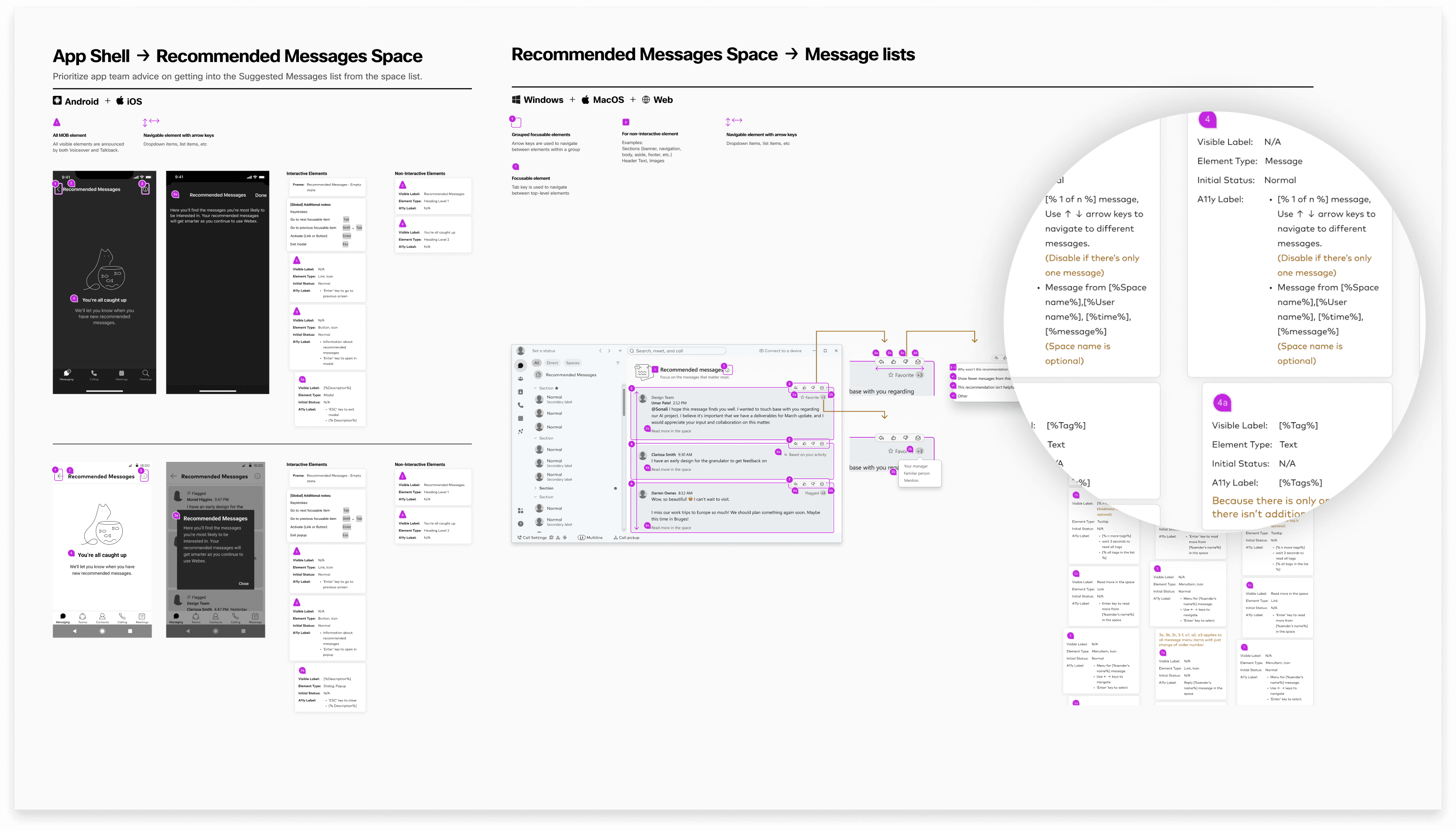
Once our UX strategy and foundational framework were approved by the broader app team, we shifted into close collaboration with UX writers and engineers. Together, we developed a comprehensive set of specifications across operating systems.
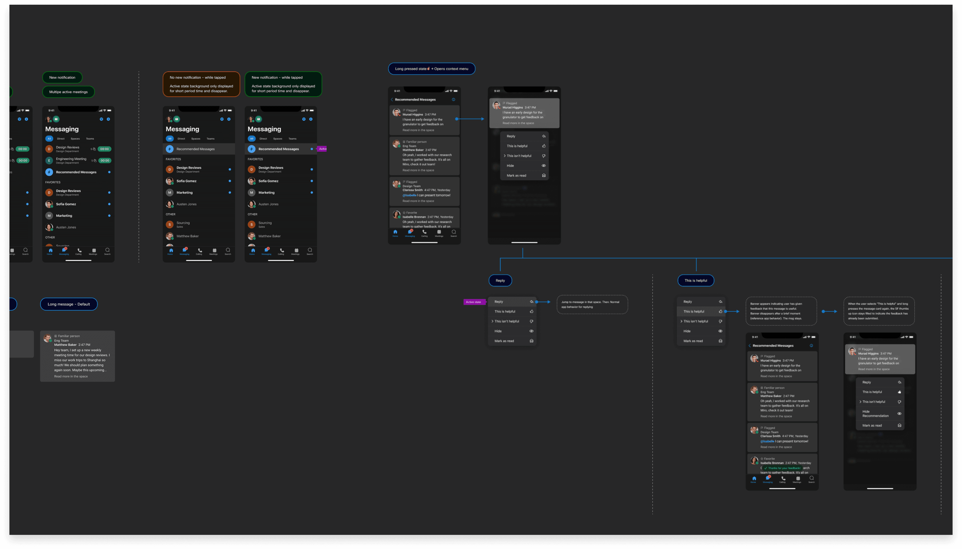
These specs went beyond UI. They included use-case flow charts that helped engineers understand how the feature behaves end to end; how each component responds to user interactions, how states change over time, and how the recommendation logic surfaces in the interface.
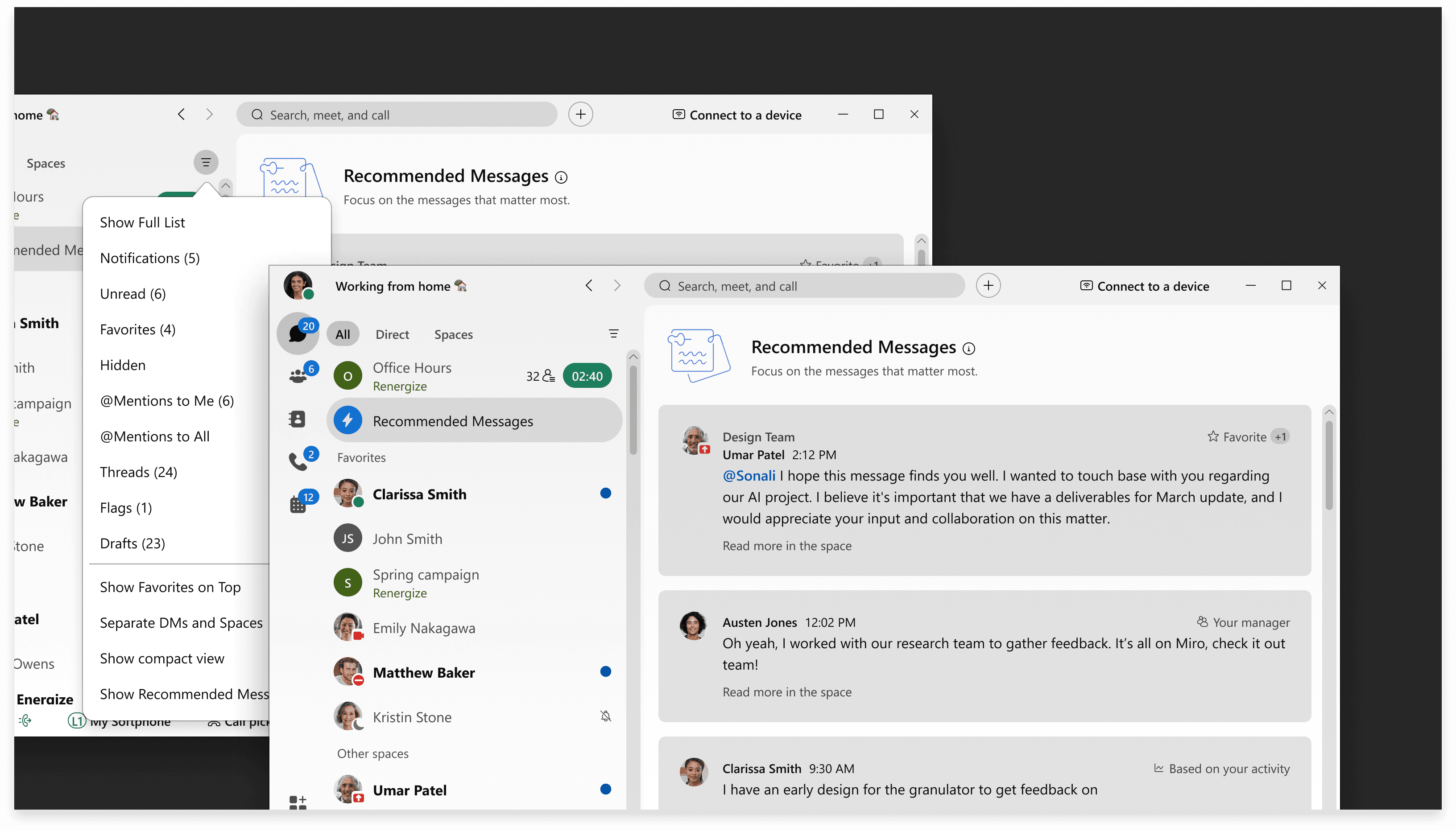
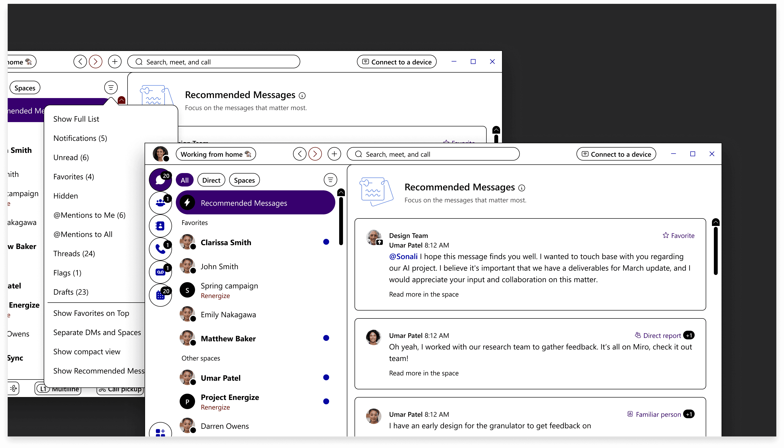
Consistent experience across every surface
While mobile led our initial design direction, we were committed to delivering a polished experience across desktop and tablet as well. I collaborated with the broader Webex design team to integrate the feature seamlessly into the existing platform, working within the established design system and adhering to requirements from the core app team.
The goal was a feature that felt native to Webex on every device — not a mobile solution stretched to fit larger screens, but a considered adaptation that respected each platform's interaction patterns and screen real estate.
Accessibility from the start
Accessibility wasn't a final QA step. Engineers, QA testers, and I worked together throughout the process to ensure the feature was usable by everyone. Before launch, I provided detailed accessibility markup covering VoiceOver, JAWS, keyboard navigation, and high-contrast modes.
This proactive approach meant accessibility was evaluated and approved by QA testers before the feature reached users, not patched afterward.
Launched and immediately adopted
Recommended Messages set out to help users cut through noise and focus on what matters. The response validated the approach:
56,000 users enabled the feature within 24 hours of launch
Traffic peaked at 3,200 recommended messages per second
Sustained engagement confirmed that users found the recommendations genuinely useful, not just novel
What this project reinforced
Designing within a large organization means navigating an extensive design system, collaborating across teams, and delivering creative solutions that respect the broader product ecosystem. This project reinforced that the best features don't feel like additions. They feel like they've always belonged.
Product design at this scale is collaborative by nature. Every decision, from interaction logic to accessibility markup to cross-platform consistency, depends on alignment across design, engineering, writing, and QA. The result is a seamless experience for over 10 million messaging users, built by a team that treated craft and coordination as equally important.