SAP Analytic Cloud
Redesigning the story-creation experience for one of the world's most widely used enterprise analytics platforms, with a focus on interaction craft, scalable patterns, and intuitive data workflows.
Year
2025 - Ongoing
Scope
Product Design, Interaction Design, Visual Design, Strategy
Compay
SAP
SAP Analytics Cloud (SAC) is a powerful enterprise analytics platform used by large organizations to build data stories, dashboards, and reports at scale. While SAC supports complex analytical workflows, its self-service story creation experience presented significant usability challenges, particularly for users transitioning from modern analytics tools like Power BI and Tableau.
This project focused on revamping the early story-creation experience, with an emphasis on: creating a clear and efficient entry point to start a data story, enabling drag-and-drop interactions that meet the quality bar users expect from modern tools, and supporting both new users and power users without sacrificing speed or control.
Phase 1: Context & Constraints
Business Context
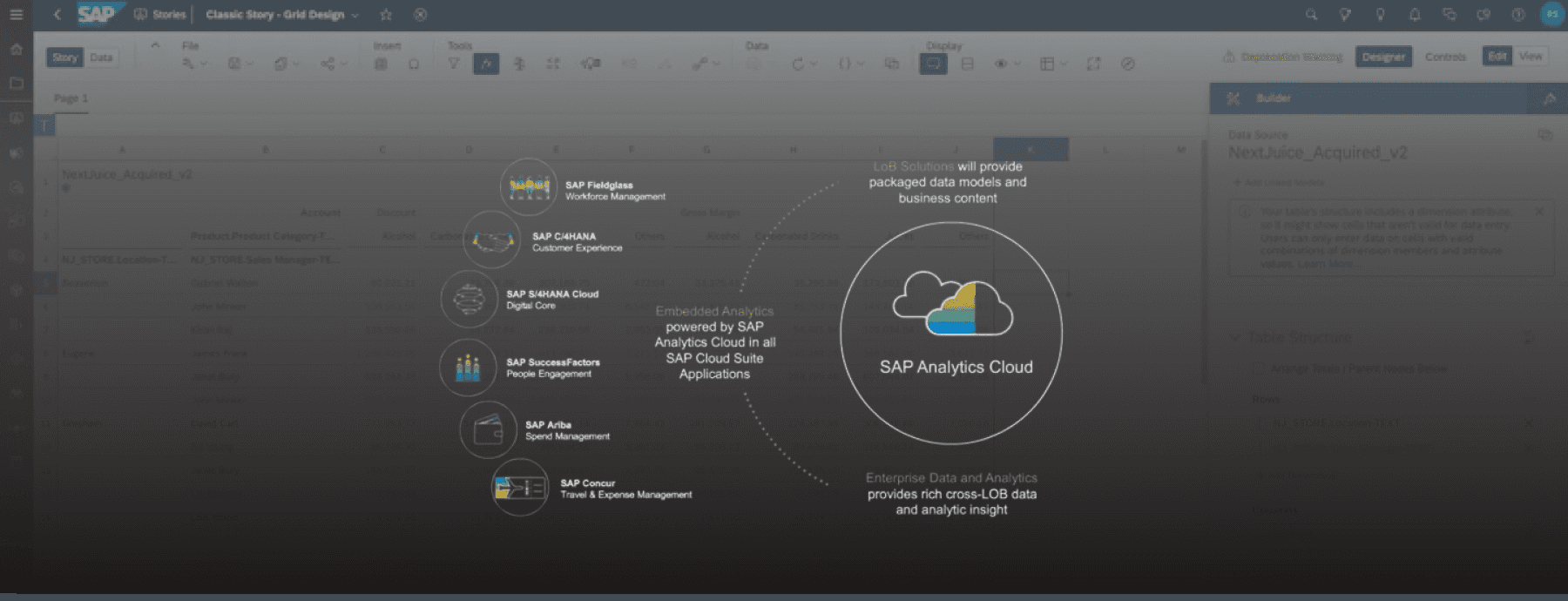
SAC is widely adopted by enterprise clients such as Bosch, Red Bull, Nestlé, and other organizations that build and iterate on data stories daily. For these users, speed and efficiency are critical to productivity. Any friction in starting a story or adding data compounds quickly at scale. Users often compare SAC directly against tools like Power BI and Tableau, so the interaction quality and visual polish needed to hold up against the best in the category.
Product Constraints
SAC is built on SAP UI5 Horizon, requiring solutions that were technically feasible and scalable within the design system. Existing onboarding relied heavily on modal lightboxes, which had mixed feedback. The platform needed to support multiple data sources (existing data models, external connections, local files), not just file upload.
My Role
I worked as the product designer embedded with the SAC team, collaborating closely with product management, engineering, and the UX research team. My primary responsibility in this phase was to identify breakdowns in the current user flow, orchestrate the ideal end-to-end flow for story creation, define where drag-and-drop assets and data entities should live within the canvas and panel system, and deliver engineering-ready designs and technical specifications grounded in real user behavior.
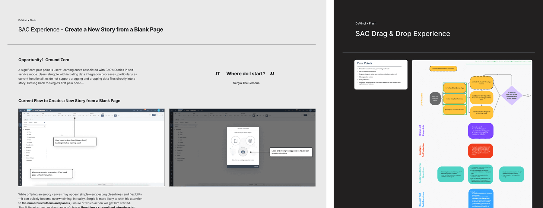
The Problem
Despite SAC's analytical power, users struggled at the very first step:
“How do I start building a data story?”
Key Challenges Observed
Users were dropped into a blank canvas with little guidance. The primary action to add data was hidden in the top shell bar under overflow menus. Drag-and-drop interactions were supported but lacked clear affordances and feedback. Power users felt slowed down, while new users felt lost.
Previous beta experiments introduced a step-by-step lightbox to guide users. While this helped first-time users orient themselves, it created friction for experienced analysts who wanted to move quickly and get work done.
Primary Pain Points We Focused On
Based on workshop synthesis, user flow analysis, and enterprise customer feedback, the team aligned on the following core pain points
No clear entry point to start a story. Starting from an empty canvas created uncertainty. Users did not know where to begin, what action was expected, or how data would flow into the story.
Hidden and fragmented data access. Adding data models, external data, or local files required navigating hidden menus. This broke user momentum and increased cognitive load, especially for new users.
Inefficient drag-and-drop experience. Users could not drag data directly into whitespace to create visualizations. Dragging entities into existing widgets or creating new ones lacked clear affordances, hit zones, or feedback.
One-size-fits-all onboarding hurt power users. Modal-based, forced onboarding helped first-time users but frustrated experienced analysts who valued speed, shortcuts, and flexibility.
Discovery & Analysis Approach
To deeply understand these issues, I conducted current-state user flow mapping, including emotional journey analysis to pinpoint frustration moments. I ran comparative analysis against Power BI and Tableau, focusing on how users initiate work from a blank state. I led persona-based walkthroughs centered on enterprise data analysts who build stories daily, and facilitated cross-functional workshops to align design, product, and engineering on shared problem definitions.
These activities revealed that drag-and-drop friction was only a symptom of a larger issue: the lack of a cohesive, intentional entry experience for story creation.
Phase 1 Outcome
As a result of this discovery phase, the team aligned on a foundational direction:
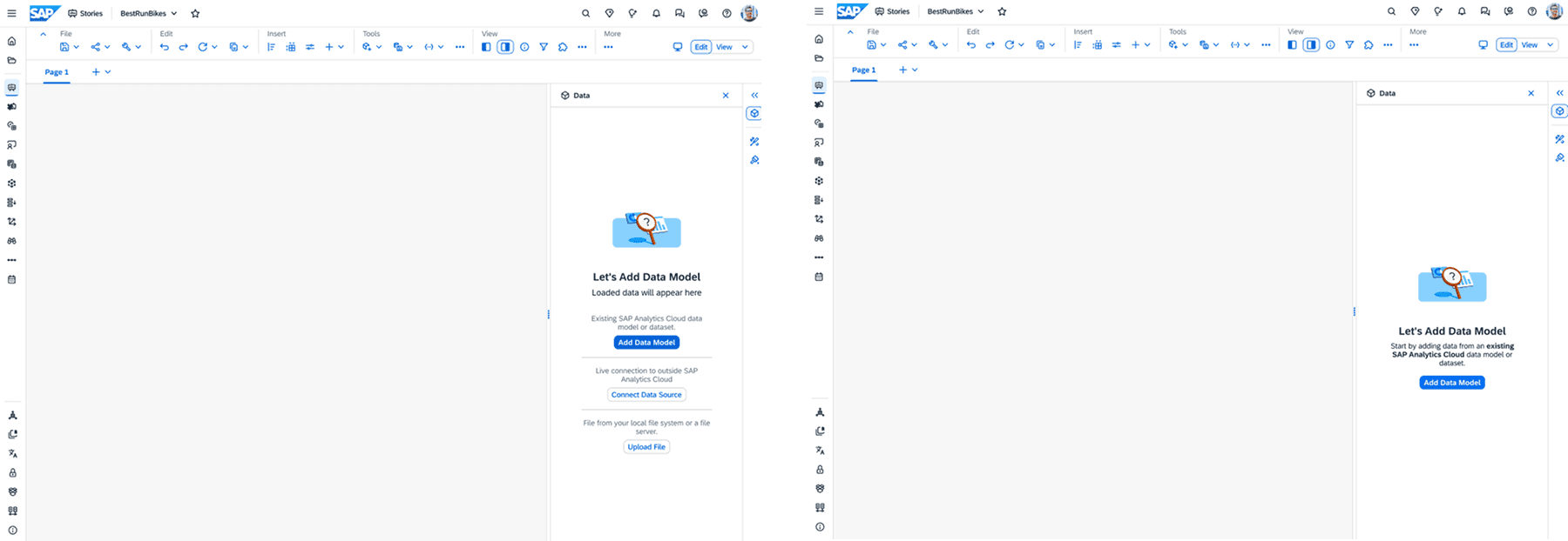
Introduce a persistent, responsive Data Panel that surfaces data access by default
Remove reliance on blocking lightboxes for core workflows
Design an entry experience that helps new users understand where to start while allowing power users to bypass guidance and work immediately
Treat drag-and-drop not as a standalone feature, but as part of a holistic story-creation flow
Phase 2: Ideation, Prototyping & Validation
Design Focus
Phase 2 centered on shaping the story-creation entry experience and defining the foundational behaviors that would enable an intuitive, scalable drag-and-drop workflow. Rather than jumping directly into interaction details, the team focused on establishing the right ground rules for how users enter a new story, discover data, understand where drag-and-drop is possible, and transition from setup to actual analysis.
This phase was critical in ensuring that drag-and-drop would feel natural and predictable, not bolted on.
Design Hypotheses
Based on Phase 1 discovery, we aligned on several key hypotheses to test:
A blank canvas needs guidance, not silence. Users need lightweight cues to understand where to start, without forcing them through rigid onboarding.
Entry-point clarity directly impacts drag-and-drop success. If users don't understand how data enters the story, drag-and-drop interactions later in the flow will feel confusing or unsafe.
Power users should control their own onboarding. Modal-driven, mandatory lightboxes create friction. Opt-out or dismissible guidance preserves speed without removing support.
A persistent data panel establishes mental models early. Making data visible by default helps users understand what actions are possible and where drag-and-drop entities originate.
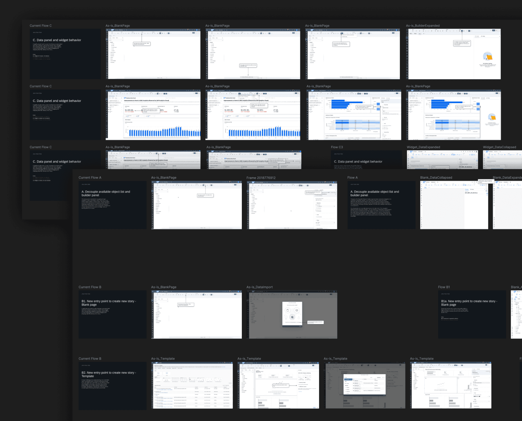
Ideation & Concept Exploration
Entry Point Concepts
We explored multiple ways to help users start a story without overwhelming them:
Empty canvas with contextual tooltips: subtle instructional nudges that guide users to click, add data, or drag entities, without blocking progress.
Reframed landing lightbox (optional): instead of removing the lightbox entirely, we tested a more intentional version with a clear value proposition, quick actions for power users, and easy opt-out with "don't show again" behavior.
This approach aligned with patterns used in multi-panel, canvas-based tools such as Adobe Creative Cloud, Tableau, and Power BI, where onboarding exists but does not interrupt expert workflows.
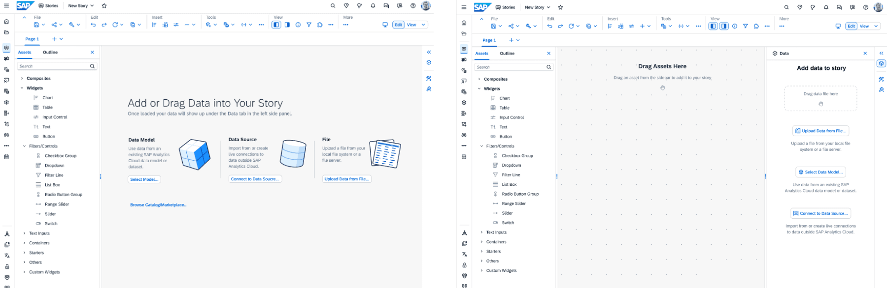
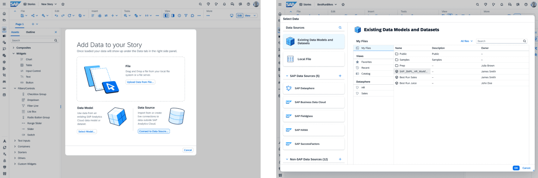
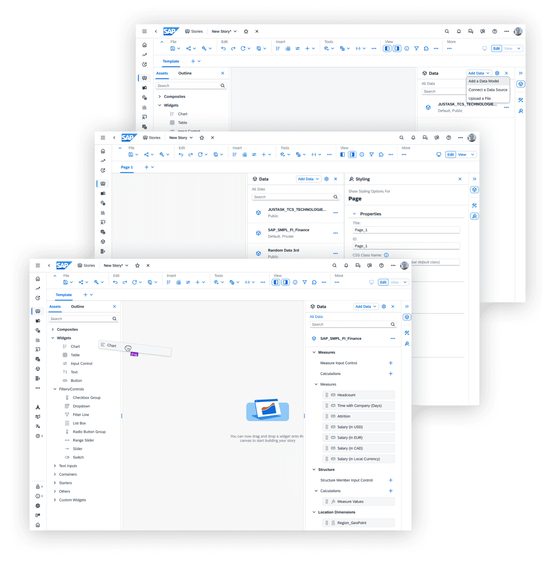
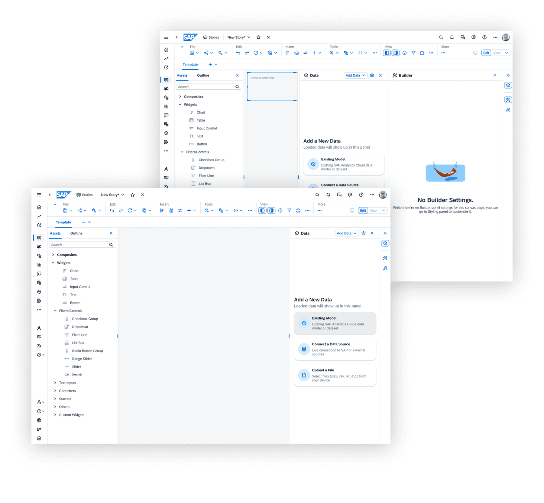
Data Panel as the Foundation
A major outcome of this phase was defining the new data panel behavior as the backbone of the experience. Data access was surfaced by default with clear hierarchy between data, assets, and builder interactions. The panel was designed to support existing data models, external connections, and local files.
The panel was intentionally designed to work in choreography with user actions:
Entry → data discovery
Data → canvas
Canvas → visualization
This established the structural foundation for drag-and-drop interactions in later phases.
Prototyping & Collaboration
To validate our ideas, we partnered closely with another SAC product designer to build interactive prototypes focused on usability and mental models.
My focus:
Curating the end-to-end flow from entry point to drag-and-drop readiness
Designing data panel behavior and interaction choreography
Ensuring clarity across transitions (entry → data → canvas)
SAC product designer:
Detailed drag-and-drop behaviors
Graph and widget creation based on entity and asset types
Visualization logic once data was introduced
This collaboration allowed us to test the entire experience holistically, while still going deep where it mattered most.

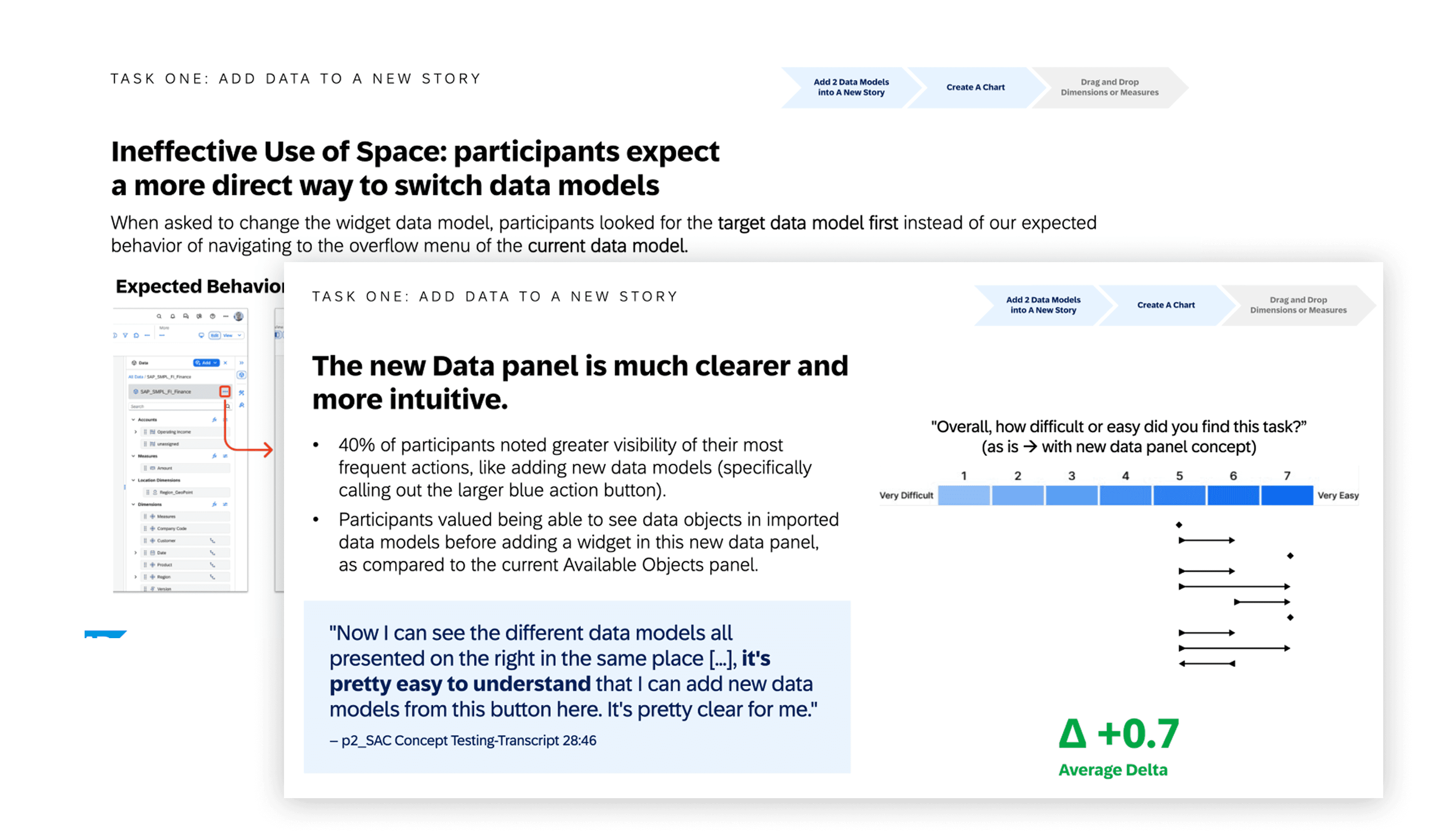
User Validation & Research Insights
We tested the interactive concepts with enterprise SAC users, focusing on usability, clarity, and expectation-setting. The research findings validated many of our assumptions and helped fine-tune the solution.
What Worked Well
Clearer starting point reduced hesitation. Users understood where to begin without needing instructions explained verbally.
Optional guidance was well received. Power users appreciated having control, while new users still felt supported.
Data panel visibility improved confidence. Seeing data available immediately helped users form a mental model of what actions were possible.
Reduced cognitive load during setup. Users spent less time searching menus and more time engaging with the canvas.
The research confirmed that we were solving the right problem, not just refining UI details.
Phase 3: Delivery, Engineering Handoff & Launch
From Concept to Production
With the experience direction validated, Phase 3 focused on turning design intent into shippable, scalable reality. The priority was not visual polish alone, but precision: ensuring the new entry experience and data panel behaviors could be implemented reliably within SAP's enterprise ecosystem.
At this stage, success depended on how well design could translate into engineering-friendly specifications while respecting the constraints of a mature, interconnected product platform.
Designing Within an Enterprise System
SAP Analytics Cloud operates within a rigid but necessary design system, built to support deeply linked product features, complex backend data relationships, and long-term evolution across multiple client implementations.
Rather than fighting these constraints, the work embraced them as guardrails for scale.
A critical part of my role was ensuring the correct design system components were used, the right component versions were referenced from the engineering repository, and design decisions aligned with existing system logic rather than one-off solutions.
This prevented fragmentation and ensured long-term maintainability.
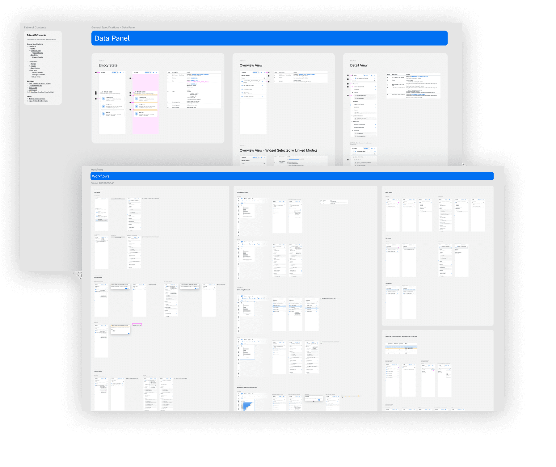
Crafting Engineering-Ready Design Specifications
I led the creation of a comprehensive design and technical specification, written in close collaboration with engineering stakeholders.
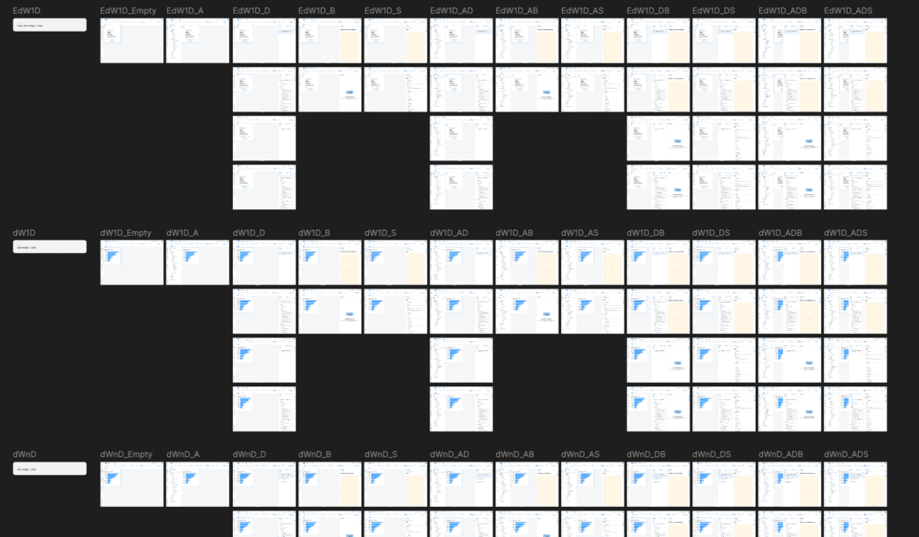
The specification included clear interaction logic for the story creation entry point, detailed data panel behaviors across states and contexts, edge cases and alternate flows (new users, power users, existing stories, templates), panel choreography and layout rules referred to internally as the floorplan, and explicit do's and don'ts tied to system constraints.
The goal was to eliminate ambiguity so engineering could build with confidence, and future designers could extend the system without breaking it.
Bridging Design, Engineering & Platform Teams
To ensure alignment, I worked continuously across SAC engineering teams, product stakeholders, and the SAP Core Design System team.
This cross-team collaboration helped bridge gaps between design intent and technical feasibility, resolve mismatches between component documentation and real-world usage, and align on shared language between design and engineering.
This level of rigor was especially important because the entry experience and data panel serve as foundational infrastructure. Without a solid base, future features such as advanced drag-and-drop behaviors would quickly become inconsistent or fragile.
Launch & Impact
The finalized specifications were successfully handed off to engineering, and the work shipped as part of a Tier-1 client update in Q1 2026.
From a broader perspective, success was measured not only by shipping or KPIs, but by trust and continuity:
SAC stakeholders responded positively to the clarity and durability of the solution
The collaboration extended into 2026, validating the approach and outcomes
I successfully onboarded and introduced my core design team to take over ongoing work, ensuring continuity without dependency on a single designer
Our team continues to iterate on the drag-and-drop experience, with ongoing design support for refinement and issue resolution. The project is ongoing.
Reflection
This phase reinforced an important lesson in enterprise product design: great UX at scale depends less on clever interactions and more on strong foundations.
By focusing on system integrity, clear specifications, and cross-functional trust, the work created a durable platform for future innovation rather than a one-time feature release.
Note: Portions of this work are confidential and under active patent review. Please do not share or screenshot.


